How to calculate and combine effect-sizes?
September 2024
CIRAD-Hortsys
What is an effect-size?
A metric that quantifies the direction and magnitude of an experimental/observational effect:
Extracted directly from publications or calculated from reported data
Standardized to be comparable across multiple primary studies
Reliable: effectively represent the underlying data (e.g., be careful of ratios with low denominators)
What is an effect-size (Visually)?
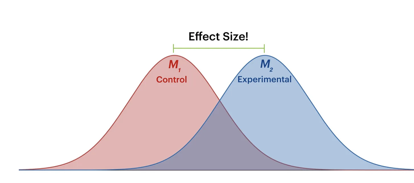
Effect-size and p-value
Statistical vs. Practical Significance
Small effect sizes can produce significant p-values with large samples but have little real-world impact.Impact of Sample Size
Large datasets make even tiny effects statistically significant, risking misinterpretation.Criticisms of p-values
see e.g., Hasley, 2019; Chen et al., 2023). Complement with confidence intervals or Bayesian approaches.
Effect-size and p-value
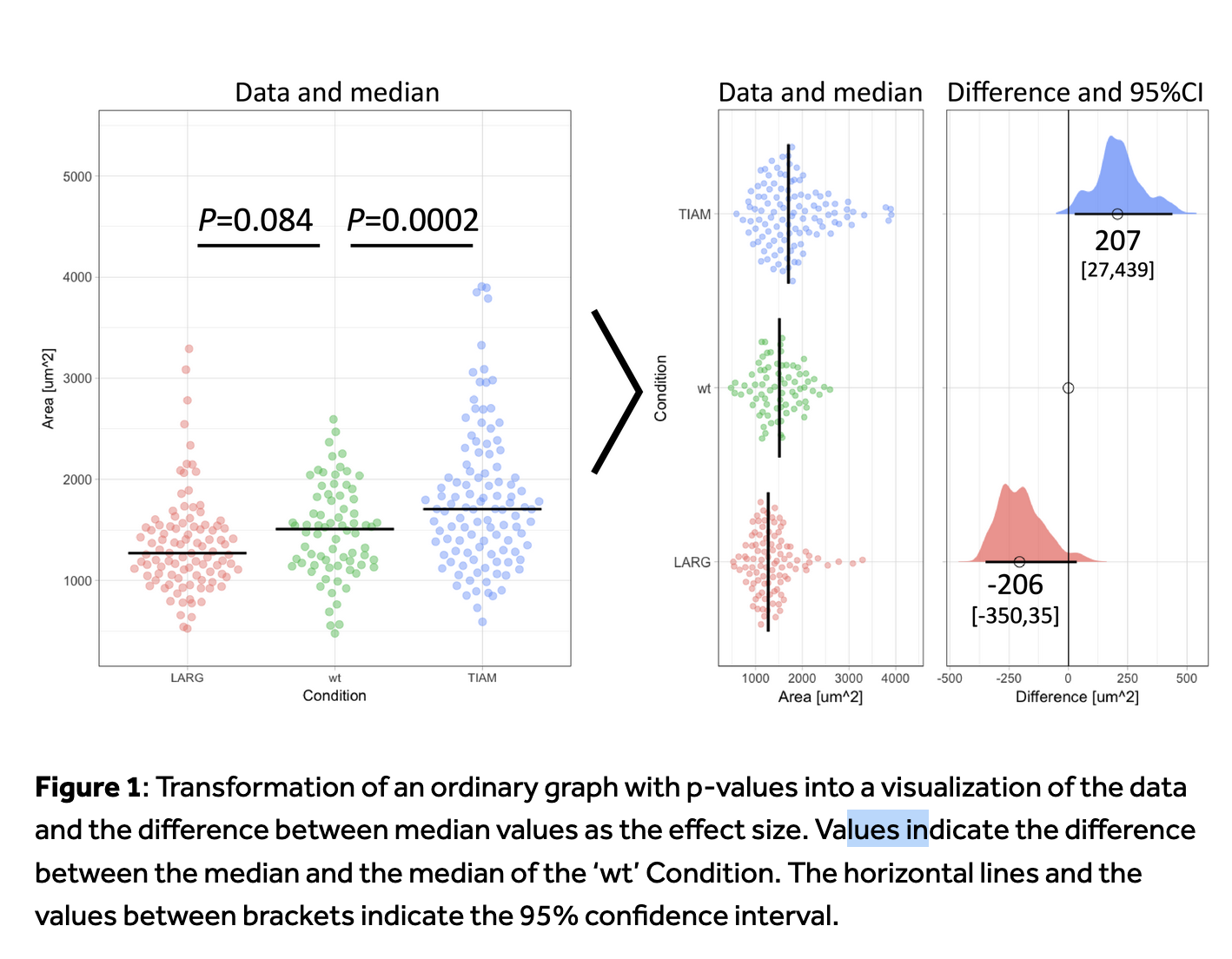 In Goedart, 2018
True vs. Estimated Effect Size
Effect sizes are typically represented by the Greek letter theta (θ):
\(𝜃ₖ\): the ‘true’ (unknown) effect size of study k
\(\hat{𝜃ₖ}\) : the observed (estimated) effect size from data in study k
The observed effect size deviates from the true effect size due to sampling error:\(𝜃ₖ\) ≠ \(\hat{𝜃ₖ}\) because \(𝜃ₖ\) = \(\hat{𝜃ₖ}\)+ \(𝜀ₖ\) (where \(𝜀ₖ\) is the sampling error)
Goal of meta-analysis
Reduce sampling error to produce accurate estimates that are as close as possible to the true effect size.
We do not know much
Unknown parameters:
- \(𝜃ₖ\), \(\hat{𝜃ₖ}\), εₖ,
What we do:
==> \(\hat{𝜃ₖ}\) ̂ : Estimated through the mean value (of a sampling distribution)
==> εₖ : Estimated through the standard error (SE).
(standard error of the mean : 𝑆𝐸= 𝑠/√𝑛 ; with n: sample size, s: standard dev)
In a perfect world
Imagine we know the true mean (μ) and standard deviation (σ) of a distribution perfectly.
e.g.
mu <- 100 # True mean
sigma <- 15 # True standard deviation
True or estimated effect-size?
- What happens if we sample this distribution?
#| standalone: true
#| viewerHeight: 600

# Load necessary libraries
library(shiny)
library(ggplot2)
library(plotly)

# Define UI for the application
ui <- fluidPage(
    titlePanel("Effect of Sample Size on Parameter Estimation"),
    sidebarLayout(
        sidebarPanel(
            sliderInput("sampleSize",
                        "Select Sample Size:",
                        min = 5,
                        max = 500,
                        value = 50,
                        step = 5)
        ),
        mainPanel(
            plotlyOutput("densityPlot")
        )
    )
)

# Define server logic for the plot
server <- function(input, output) {
    output$densityPlot <- renderPlotly({
        # Set parameters
        mu <- 100  # True mean
        sigma <- 15  # True standard deviation

        # Generate sample based on slider input
        sample_size <- input$sampleSize
        sample_data <- rnorm(sample_size, mean = mu, sd = sigma)

        # Create data frame for plotting
        df <- data.frame(value = sample_data)
        MEAN <- round(as.numeric(mean(df$value)))
        SD <- round(as.numeric(sd(df$value)))

        # Plot density
        p <- ggplot(df, aes(x = value)) +
            geom_density(fill = "blue", alpha = 0.5) +
            geom_vline(aes(xintercept = mu), color = "red", linetype = "dashed", size = 1) +
            labs(title = paste("Sample Size:", sample_size,
                               "mean", MEAN,
                               "sd", SD),
                 x = "Value",
                 y = "Density") +
            theme_minimal()

        ggplotly(p)
    })
}

# Run the application
shinyApp(ui = ui, server = server)
An Effect Size for All Your Needs
Depending on your experimental design, research question, and the type of outcome you are interested in, various effect sizes can be applicable.
An Effect Size for All Your Needs
| Effect Type | Description |
|---|---|
| Cohen’s d | Effect size between two means. |
| Hedges’ g | Corrected Cohen’s d for small samples. |
| Correlation (r) | Strength and direction of a linear relationship. |
| Eta-squared ((^2)) | Proportion of variance explained in ANOVA. |
| Partial Eta-squared | Proportion of variance explained by an effect, controlling others. |
An Effect Size for All Your Needs
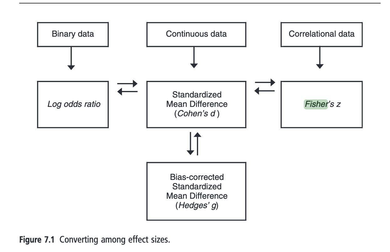
An Effect Size for All Your Needs
| Effect Type | Description |
|---|---|
| Odds Ratio (OR) | Measures the strength of association between two events. |
| Risk Ratio (RR) | Compares the risk of an event between two groups. |
| Phi Coefficient | Measures the association between two binary variables. |
Mean Difference (MD) Calculation
1. Mean Difference (MD)
\[MD = M_1 - M_2 \] with M1: Mean of group 1 - M2: Mean of group 2
2. Standard Error of the Mean Difference (SE MD)
\[SE_{MD} = SD_{pooled}\sqrt{\frac{1}{n_1} + \frac{1}{n_2}}\] With- SD1 : Standard deviation of group 1 - SD2 : Standard deviation of group 2 - n1 , n_2 : Sample sizes
3. Pooled Standard Deviation (spooled)
\[SD_{pooled} = \sqrt{\frac{(n_1 - 1) \cdot SD_1^2 + (n_2 - 1) \cdot SD_2^2}{n_1 + n_2 - 2}}\]
Plant Growth in Different Soil Types
| Variable | Soil A | Soil B |
|---|---|---|
| Mean Height ((M)) | 25 cm | 20 cm |
| Standard Deviation ((SD)) | 4 cm | 5 cm |
| Sample Size ((n)) | 30 | 30 |
Calculations
Mean Difference: \[ MD = 25 - 20 = 5 \text{ cm} \]
Pooled Standard Deviation:
\[ SE_{MD} = \sqrt{\frac{(30 - 1) \cdot 4^2 + (30 - 1) \cdot 5^2}{30 + 30 - 2}} \cdot \sqrt{\frac{1}{30} + \frac{1}{30} } = 1.18 \]
Variables to Retrieve from Primary Studies
- Mean ((M))
- For each compared group.
- Standard Deviation ((SD))
- Standard deviation for each group.
- Sample Size ((n))
- Number of observations in each group.
Advantages and Disadvantages of Mean Difference (MD)
Advantages:
- Simplicity: Easy to understand and interpret.
- Direct Measurement: Represents a direct measure of the effect between two groups.
- General Applicability: Useful across various fields (biology, psychology, etc.).
Disadvantages:
- Sensitivity to Samples: Can be influenced by sample variability.
- Data Distribution: Requires a normal distribution for valid interpretations.
Standardized Mean Difference (Cohens’d)
\[ d = \frac{M_1 - M_2}{S_{within}} \]
\[ S_{within} = \sqrt{\frac{(n_1 - 1)S_1^2 + (n_2 - 1)S_2^2}{n_1 + n_2 - 2}} \]
Where: - M_1 and M_2 represent the sample means of the two groups. S_{within}, is the pooled within-groups standard deviation: - n_1 and n_2 are the sample sizes of the two groups, - S_1 and S_2 are the standard deviations of the two groups.
\[ SE_d = \sqrt{\frac{n_1 + n_2}{n_1 n_2} + \frac{d^2}{2(n_1 + n_2)}} \]
Standardized Mean Difference (Cohens’d)
- Interpretation : SMD= 2 -> a difference of 2 standard deviations
- BUT bias when the sample size of a study is small, especially when n≤ 20 (L. V. Hedges 1981).
Hedges’ (g)
\[ g = d \times \left(1 - \frac{3}{4N - 1}\right) \] - (N): Total sample size ( (N = n_1 + n_2) )
\[ SE_g = \sqrt{J^2\times SE_d^2} \]
Plant growth in different soil
| Variable | Soil A | Soil B |
|---|---|---|
| Mean Height ((M)) | 25 cm | 20 cm |
| Standard Deviation ((SD)) | 4 cm | 5 cm |
| Sample Size ((n)) | 30 | 30 |
Calculations
Cohen’s (d): \[ d = \frac{5}{4.58} \approx 1.09 \]
Hedges’ (g): \[ g = 1.09 \times \left(1 - \frac{3}{4(60) - 1}\right) \approx 1.08 \]
Advantages and Disadvantages of Cohen’s (d) and Hedges’ (g)
Advantages:
- Standardized Measure: Allows for comparison across studies.
- Applicability: Useful in various fields (ecology, psychology, etc.).
Disadvantages:
- Sample Size Sensitivity: May be affected by small sample sizes.
- Assumption of Normality: Requires normality for accurate interpretation.
- Interpretability: Not so clear understanding of effect sizes.
Ratio Calculation
1. Ratio (R)
\[R = \frac{X_1}{X_2} \]
- X_1: Mean value or proportion in group 1
- X_2: Mean value or proportion in group 2
where: - \(SD_{\text{pooled}}\): Pooled standard deviation - \(X_1\): Mean of group 1 - \(X_2\): Mean of group 2 - \(n_1, n_2\): Sample sizes of the two groups
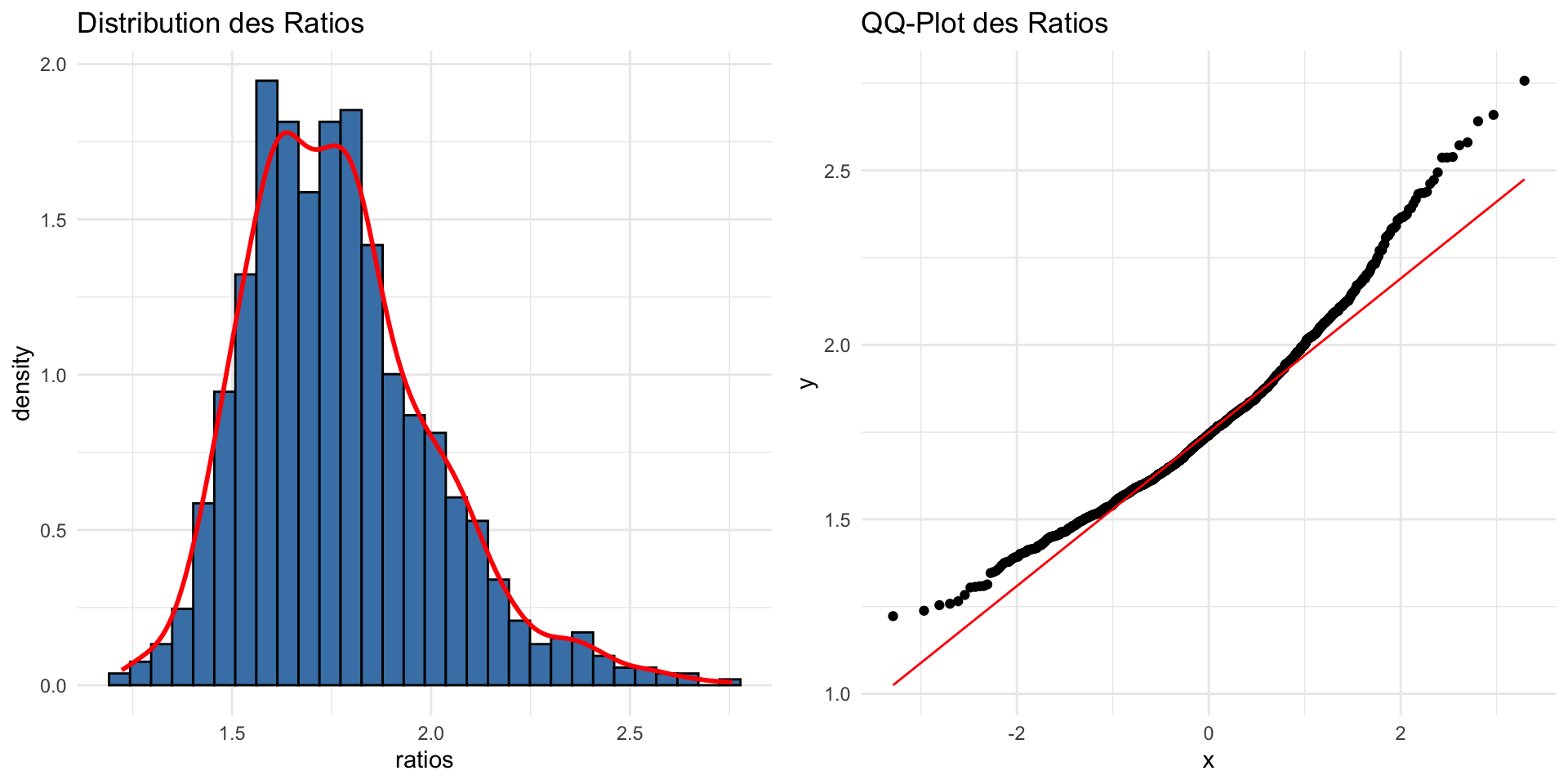
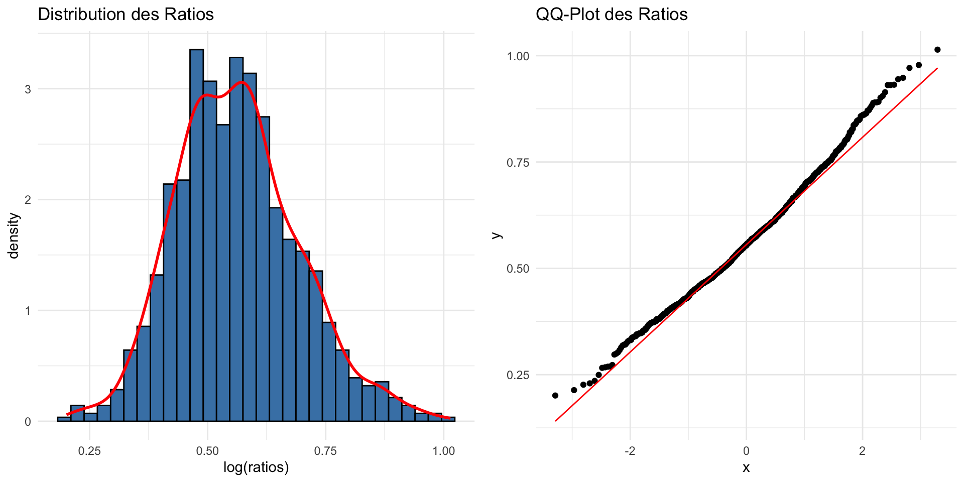
Ratio :non-normal distribution
- Lead to non normal distribution
Logarithmic Transformation for Ratio
\[\log R = \ln\left(\frac{X_1}{X_2}\right)\] Log transformation is often used to stabilize variance and normalize the distribution.
\[ SE_{\ln R} = SD_{\text{pooled}} \sqrt{ \left( \frac{1}{n_1 \cdot (X_1)^2} \right) + \left( \frac{1}{n_2 \cdot (X_2)^2} \right) } \]
where: - \(SE_{\ln R}\): Standard error of the log response ratio - \(SD_{\text{pooled}}\): Pooled standard deviation - \(X_1\): Mean of group 1 - \(X_2\): Mean of group 2 - \(n_1, n_2\): Sample sizes of the two groups
Logarithmic Transformation for Ratio
Adjustments for Ratio-Based Effect Sizes
- Correction for Small Sample Size:
- Log Response Ratio (LnR) tends to be biased when sample sizes are small.
- Apply bias corrections to reduce overestimation or underestimation.
- Variance estimations need adjustment, especially when the response ratio is highly skewed.
Corrected Log Response Ratio (LnR_corr)
\[ \text{LnR}_{corr} = \ln\left(\frac{X_1}{X_2}\right) - \frac{1}{2} \cdot \left(\frac{SD_{X1}^2}{n_1 X_1^2} + \frac{SD_{X2}^2}{n_2 X_2^2}\right) \]
Where:
- ( X_1, X_2 ): Group means.
- ( SD_{X1}, SD_{X2} ): Standard deviations.
- ( n_1, n_2 ): Sample sizes.
References: Lajeunesse, M. J. (2011)
Comparing Plant Growth
| Variable | Soil A | Soil B |
|---|---|---|
| Mean Plant Height (X) | 25 cm | 20 cm |
| Standard Deviation (SD) | 4 cm | 5 cm |
| Sample Size (n) | 30 | 30 |
Ratio and LogRatio
\[ R = \frac{25}{20} = 1.25 \] and \[\log R = \ln(1.25) \approx 0.223\]
Standard Error of Log Ratio (SE Log Ratio):
\[ SE_{\ln R} = 4.53 \cdot \sqrt{ \left( \frac{1}{30 \cdot 25^2} \right) + \left( \frac{1}{30 \cdot 20^2} \right) } \approx 0.053 \]
Correlation
Correlation Coefficient (r)
\[ r = \frac{Cov(X, Y)}{SD_X \cdot SD_Y} \]
Where: - ( Cov(X, Y) ): Covariance between variables ( X ) and ( Y ) - ( SD_X ): Standard deviation of variable ( X ) - ( SD_Y ): Standard deviation of variable ( Y )
Standard Error of the Correlation Coefficient (SE)
\[ SE_r = \frac{1 - r^2}{\sqrt{n - 2}} \]
Where: - n: Sample size
Correlation
- Non normal distribution
#| standalone: true
#| viewerHeight: 600
library(shiny)
library(ggplot2)
library(plotly)

# Fonction pour générer des données avec une corrélation spécifiée
generate_data <- function(n, correlation_target) {
  correlations <- replicate(n, {
    x <- rnorm(20, mean = 10, sd = 1)  # Variable indépendante
    y <- correlation_target * x + rnorm(10, mean = 0, sd = sqrt(1 - correlation_target^2))  # Variable dépendante
    cor(x, y)  # Calcul de la corrélation
  })

  return(data.frame(Iteration = 1:n, Correlation = correlations))
}

# Transformation de Fisher
fisherz <- function(r) {
  return(0.5 * log((1 + r) / (1 - r)))
}

# Interface utilisateur
ui <- fluidPage(
  titlePanel("Simulation de Corrélation"),
  sidebarLayout(
    sidebarPanel(
      sliderInput("sample_size",
                  "Taille de l'échantillon:",
                  min = 5,
                  max = 200,
                  value = 15),
      sliderInput("correlation_target",
                  "Corrélation cible:",
                  min = -1,
                  max = 1,
                  value = 0.8,
                  step = 0.01)
    ),
    mainPanel(
      plotlyOutput("densityPlot")  # Utilisation de plotly pour l'histogramme
    )
  )
)

# Serveur
server <- function(input, output) {
    output$densityPlot <- renderPlotly({
        # Générer les données
        data <- generate_data(input$sample_size, input$correlation_target)

        # Transformation de Fisher sur les corrélations
        data$Fisher <- fisherz(data$Correlation)

        # Créer le graphique de densité
        p <- ggplot(data) +
            geom_density(aes(x = Correlation, y = ..density..), fill = "lightblue", alpha = 0.5) +
            geom_density(aes(x = Fisher, y = ..density..), color = "red", size = 1)  +
            ggtitle("Densité des Corrélations et Transformées par Fisher") +
            xlab("Valeurs") +
            ylab("Densité") +
            theme_minimal() +
            scale_color_manual(name = "Légende", values = c("lightblue" = "Brutes", "red" = "Fisher", "green" = "Normale")) +
            labs(color = "Type de Densité")+
          xlim(-3,3)

        # Convertir ggplot en plotly
        ggplotly(p)
    })
}

# Lancer l'application
shinyApp(ui = ui, server = server)
Fisher’s Transformation
Fisher’s transformation is used to stabilize the variance and make the sampling distribution of the correlation coefficient more normal:
\[ z_r = \frac{1}{2} \cdot \ln \left( \frac{1 + r}{1 - r} \right) \]
Where:
- r: Observed correlation coefficient
- z_r: Fisher-transformed value
Standard Error of ( z_r )
\[ SE_{z_r} = \frac{1}{\sqrt{n - 3}} \]
Where:
- n : Sample size
Key Takeaways: Soil Experiment Example
Comparison of Plant Growth in Two Soil Types:
Variable Soil A Soil B Mean Height 25 cm 20 cm Standard Deviation 4 cm 5 cm Sample Size (n) 30 30 Effect Size Calculations:
- Mean Difference (MD): 5 cm
- Cohen’s d: 1.09
- Hedges’ g: 1.08
- Ratio: 1.25
- log(Ratio): 0.0223
- Mean Difference (MD): 5 cm
Important Considerations for Effect Sizes
- Data Characteristics:
- Ensure assumptions of normality and homogeneity of variance are met.
- Consider small sample size biases, especially with Cohen’s d.
- Interpretation:
- Choose the appropriate effect size based on study design (e.g., continuous vs. categorical data).
- Understand practical significance beyond just statistical significance.
- Use of Correct Formulas:
- When sample sizes differ, use pooled standard deviations for accurate mean differences.
- Apply corrections like Hedges’ g for small sample sizes to minimize bias.
Key References for Effect Size Calculations
- Borenstein et al. (2009):
- Comprehensive guide on effect size calculations and interpretations.
- Essential for meta-analyses and evidence synthesis.
- The
escandmetaforPackages:- R tools for calculating various effect sizes.
- Use
metaforfor meta-analytic models and conversions between effect types.
- Practical Meta-Analysis (Lipsey & Wilson):
- Resource for practical guidance on interpreting and reporting effect sizes.
- Includes guidance on which effect size to use based on research context.
How to calculate and combine effect-sizes?